A Year of Storytelling: GUC Human Resources Magazine Trilogy
Global Unichip Corp.
HR Division Magazine Series
A magazine series capturing HR members’ shared stories and reflections, serving as a professional yet warm record that celebrates milestones and marks each chapter in their development.
‧ Led visual direction and layout design, including all cover art.
‧ Managed project scheduling, budgeting, and print production on schedule.
‧ Developed intuitive templates to ensure consistency across issues among writers.
‧ Collaborated with 40+ writers, editors, and HR stakeholders.
Planning → Design → Production → Delivery
‧ Met with the HR Head to align goals, audience needs, and overall tone.
‧ Collected and reviewed contributor content to inform layout planning.
‧ Provided specifications and presented preliminary layouts for feedback.
‧ Developed the visual identity, including color palette, typography, and graphic elements.
‧ Designed 100+ initial layouts and cover concepts to explore visual directions.
‧ Iterated designs based on stakeholder feedback.
‧ Finalized print-ready files.
‧ Coordinated with the printer to manage proofs, revisions, and delivery timelines.
‧ Reviewed sample copies for quality and presented to HR Head for final approval.
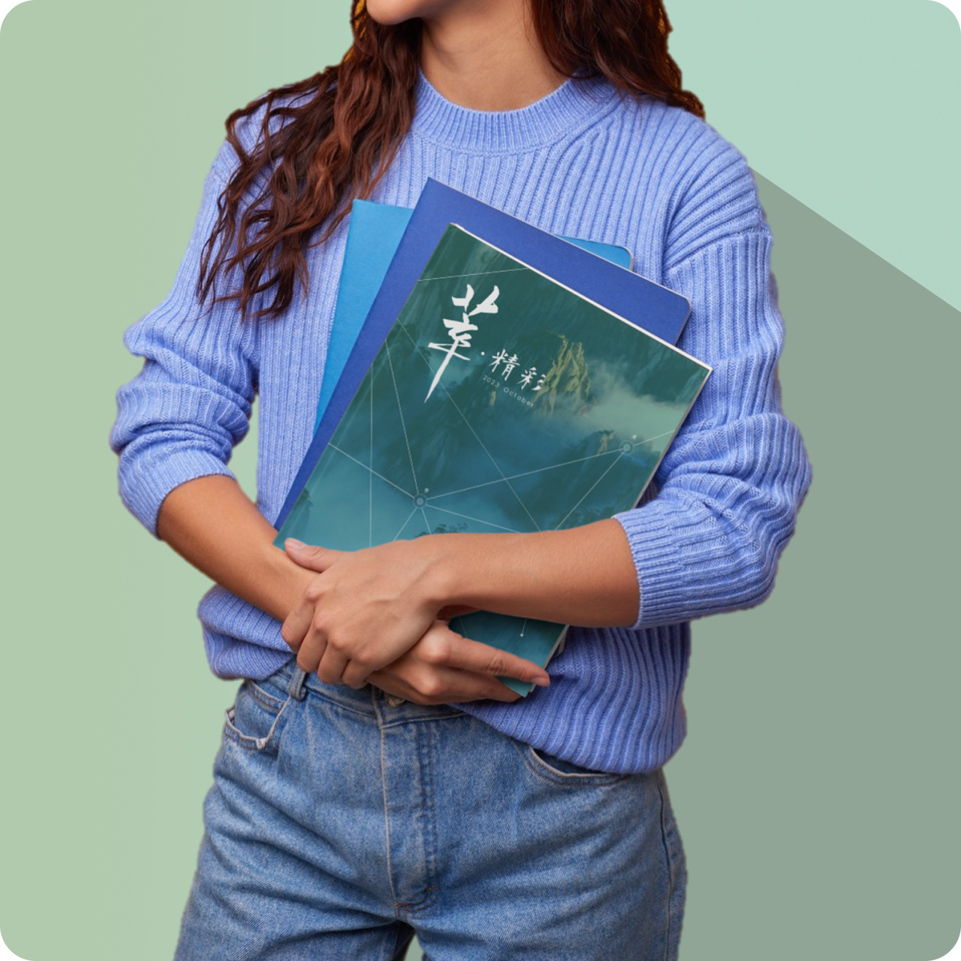
Issue I
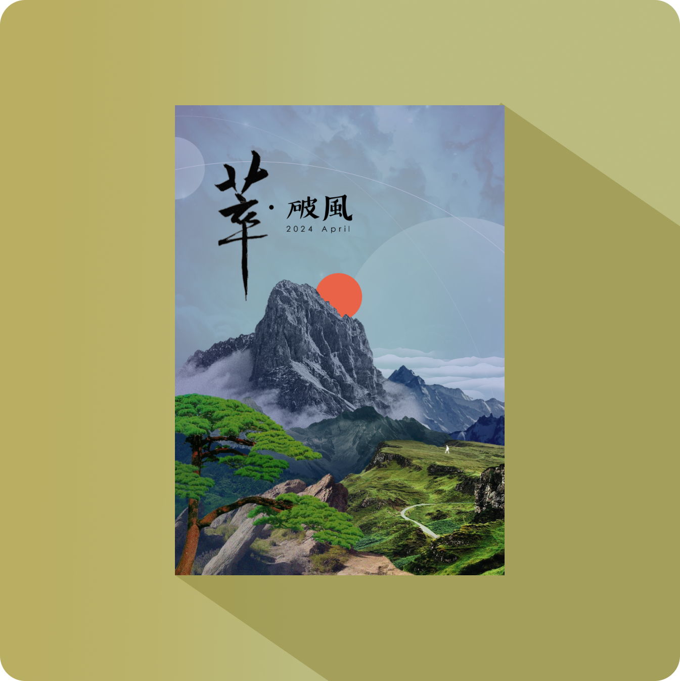
The mountains stand distant and shrouded in mist, a blurred view that is yet to be unveild as we begin our ascend towards knowledge and growth.
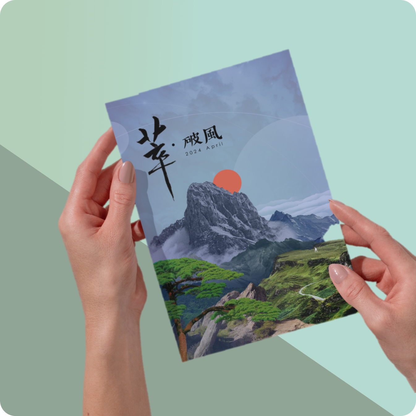
Issue II
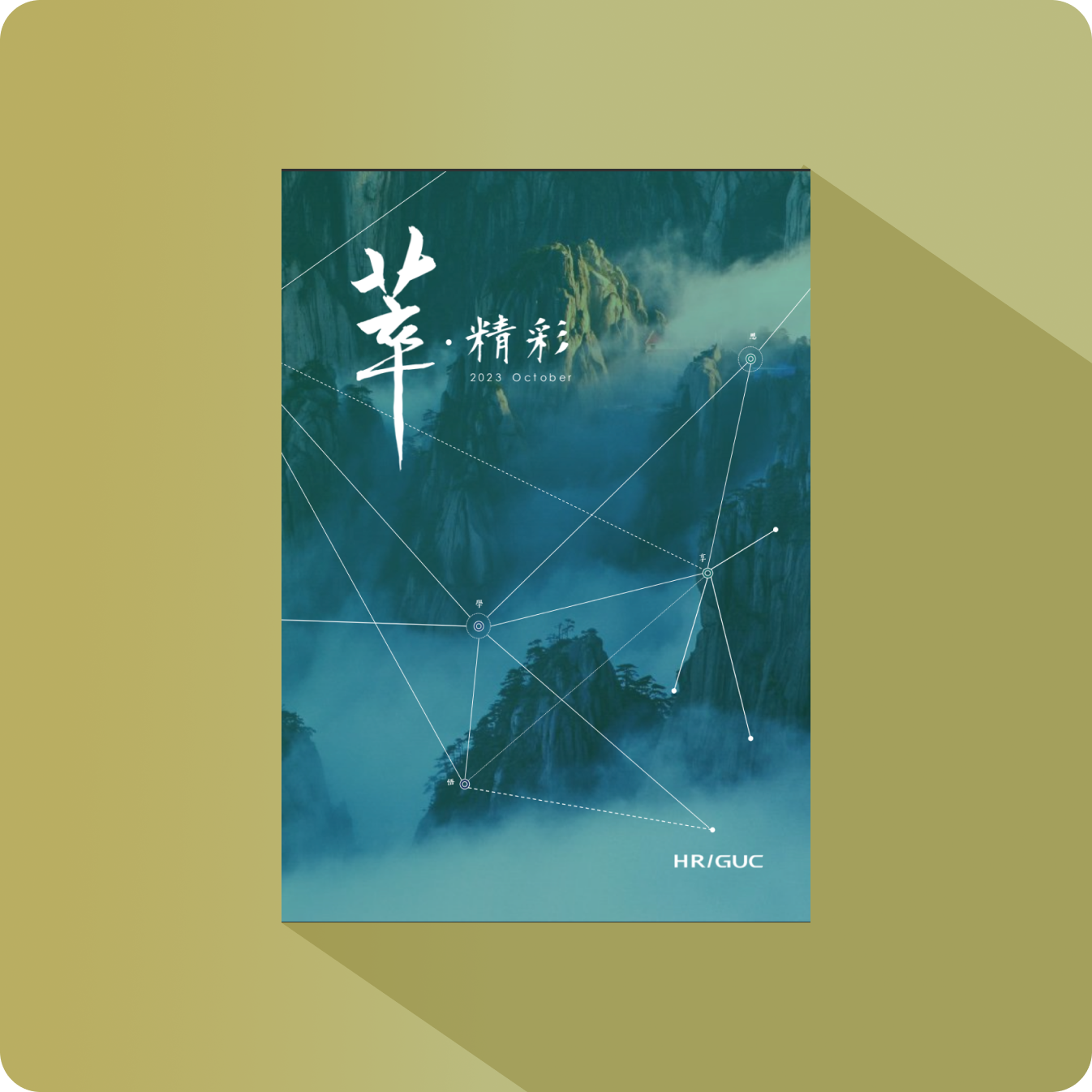
The path of growth is winding and covers vast terranes, a journey filled with new discoveries and perspectives.
Issue III
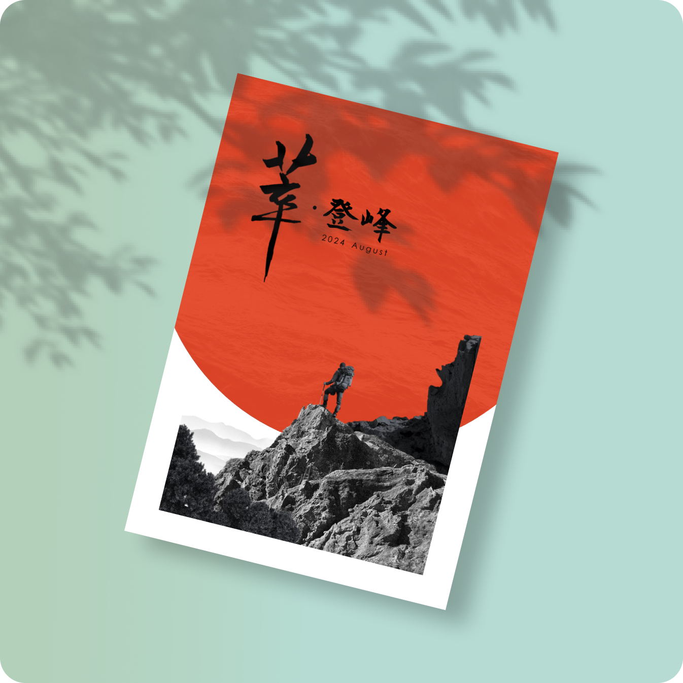
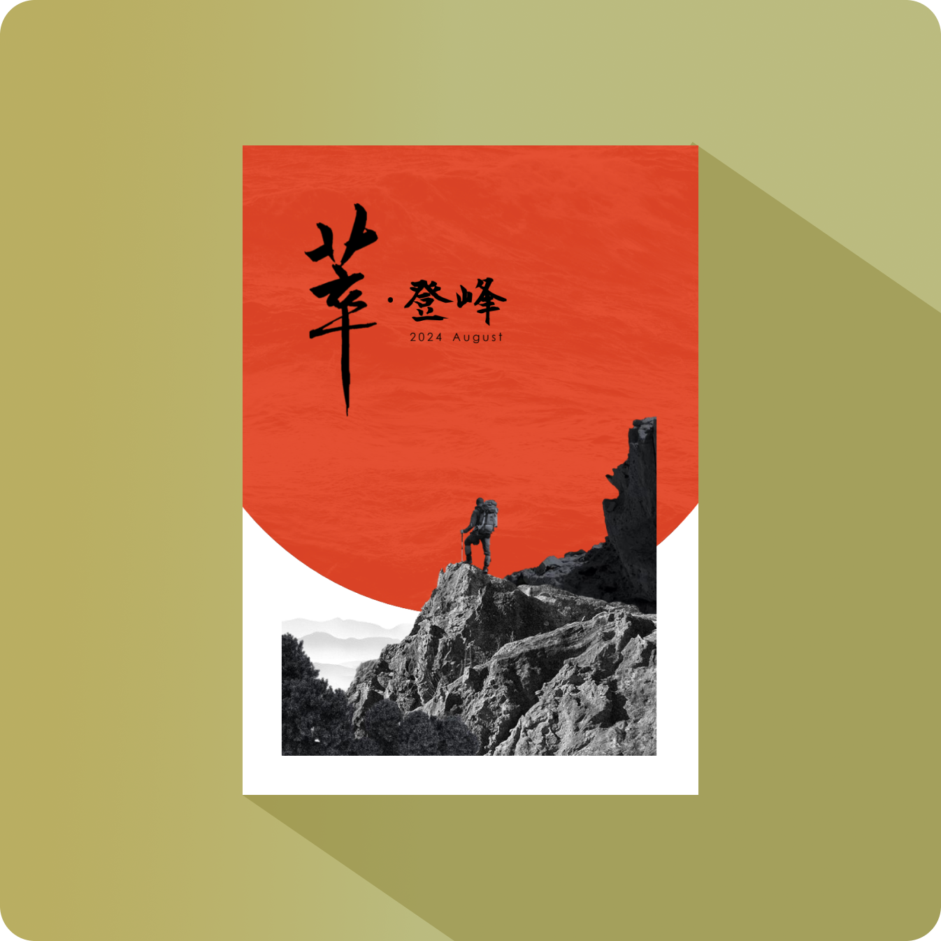
Reaching the summit, we have not come to the end. From here, we see how far we’ve come and how much more there is to explore with clearer vision.
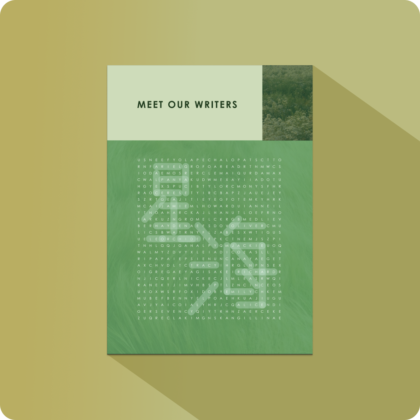
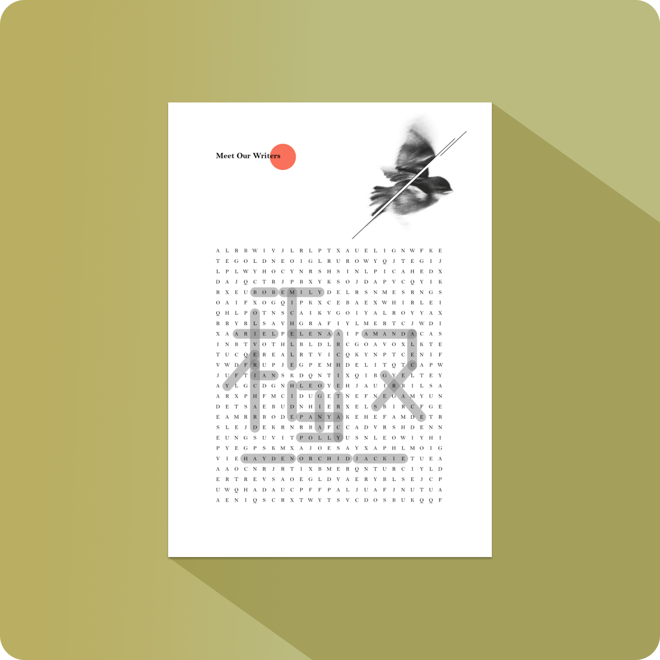
I designed interactive word puzzles that consisted of all author names at the beginning of each issue.
When all names are circled, Chinese characters that best represent the theme of each issue appears.
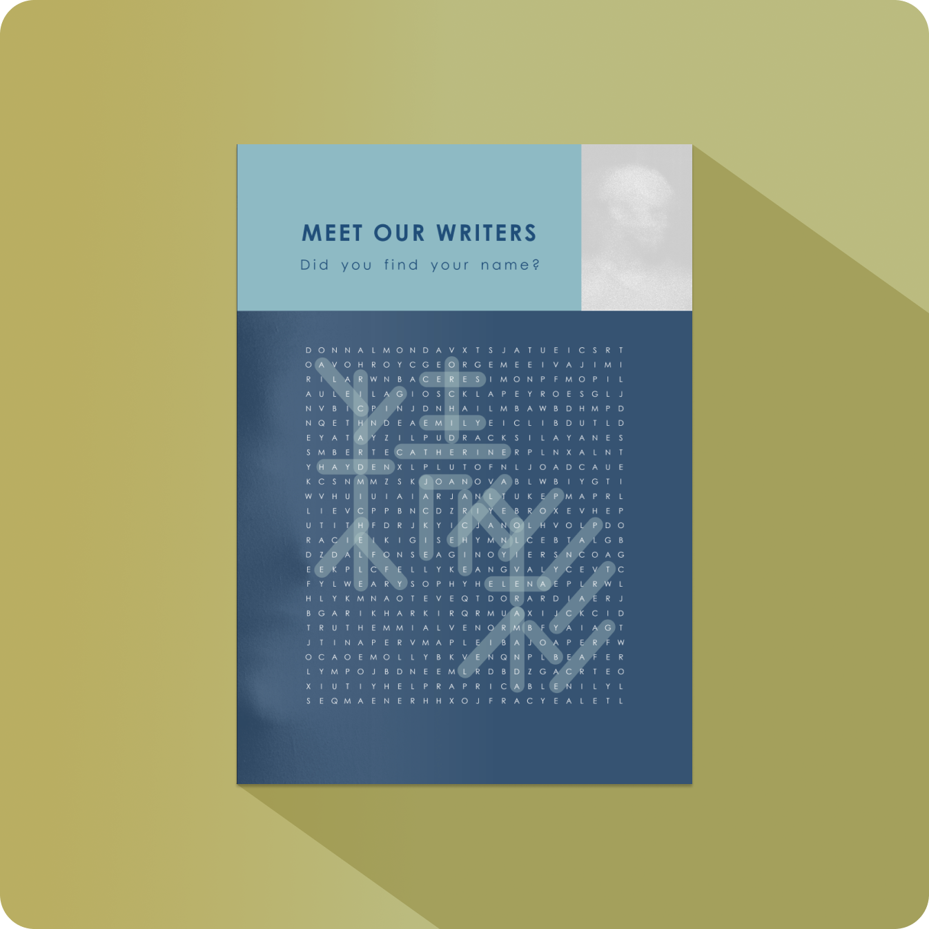
Issue I
"精彩" refers to the "abundance" of stories shared from experience.
Issue II
"星海" refers to a "sea of knowledge and insight" that awaits to be discovered.
Issue III
"極" refers to the "utmost beauty" when positioned at the top of the summit.
Intuitive Template Design
Due to the limitations of the tools available, all pages were designed in PowerPoint, which lacked advanced layout features to streamline the designing process.
To address this,
I developed intuitive templates that simplified production and guided collaborators to “fill in the blanks” with ease, ensuring consistency and efficiency across publications.
Format Consistency Assurance
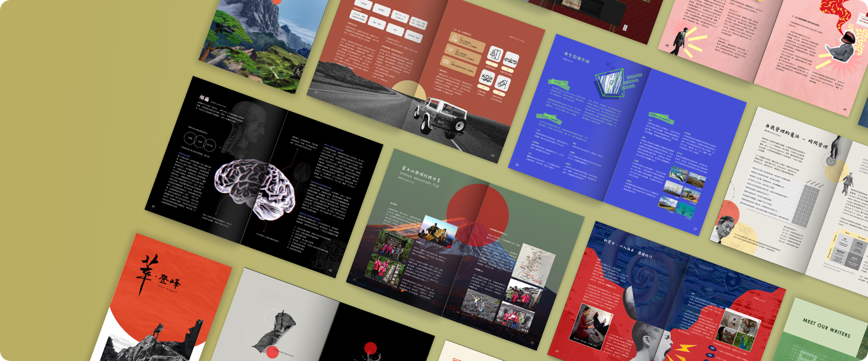
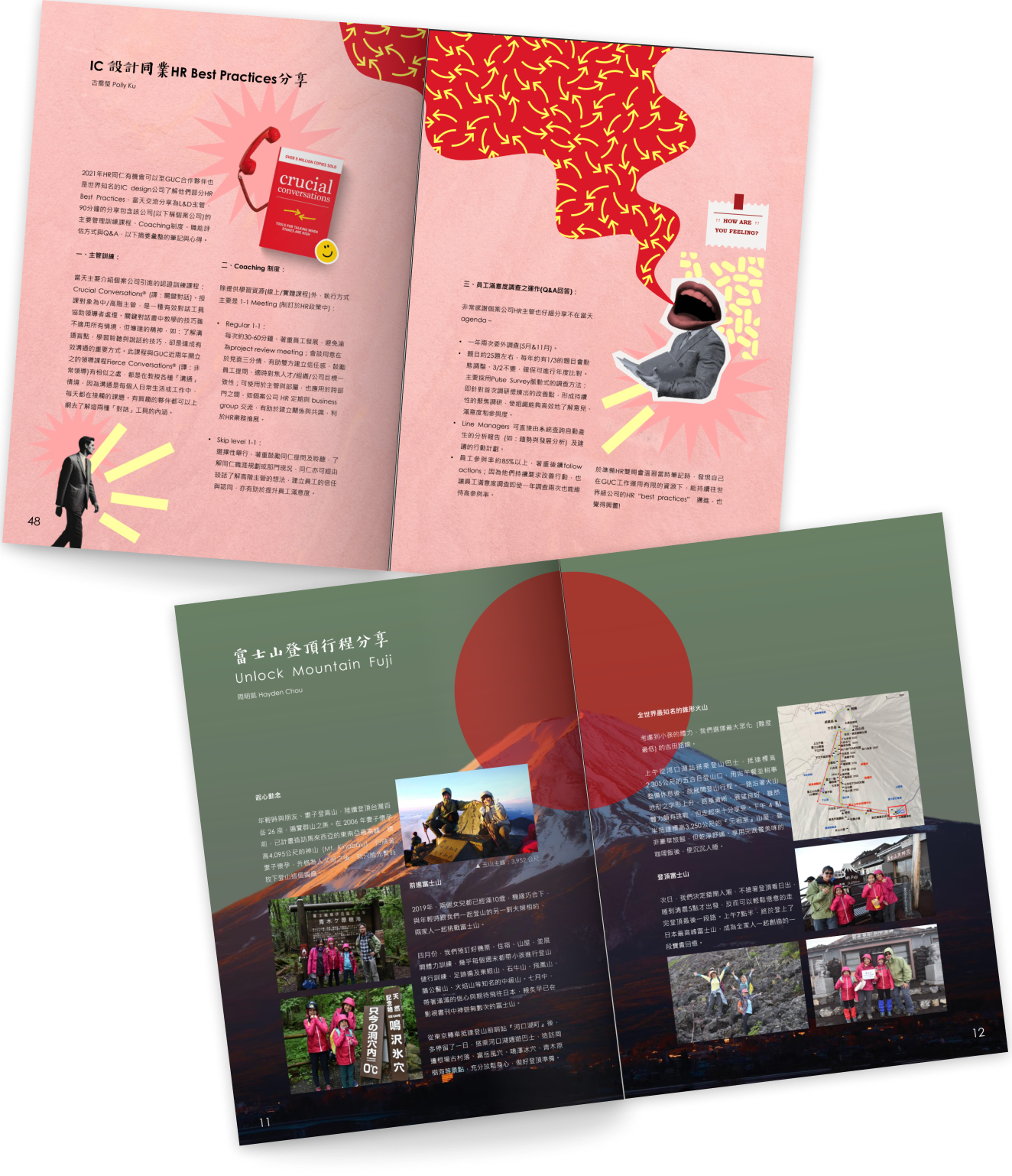
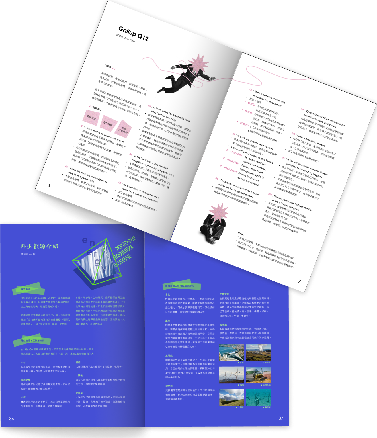
Working with a team of contributors who were primarily non-professional writers, I often received materials with varying levels of visual quality and constant inconsistencies; like newsclippings, slide screenshots, or photos of photos, etc.
Anticipating this,
I focused on the strategic placement of images, creating design layouts that harmonized diverse (even chaotic) styles into polished, cohesive publications.
Customized Graphic Design
Articles were collected among a wide range of contributors addressing a variety of topics. Many of these topics were new or foreign its reader. Therefore, it relied on strategic use of graphics and visual aid to engage readers' interest.
To address this,
each article was custom-designed with its own visual elements and theme. As a result, the publication became as much a lookbook of ideas as it was a record of shared memories.
Received positive feedback from HR leadership and contributors, who noted that the magazine helped foster a sense of community, recognition, and memory-keeping.
Our HR Head referred to it as “the essence of our endeavors.”